
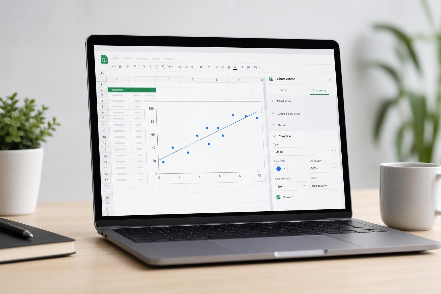
A trendline can make a Google Sheets chart much easier to understand by showing the overall direction of your data. Whether you want to highlight growth, decline, or a relationship between two variables, Google Sheets gives you several ways to add and customize a trendline.
This guide walks through the exact steps to add a trendline, explains the available trendline types, and shows which formatting options are most useful when you want a chart that is both accurate and easy to read.
Before You Add a Trendline
Trendlines work best on charts that show a relationship between values, especially scatter charts and line charts with numeric data. In many cases, they are most useful when your data points follow a general pattern rather than a completely random spread.
- Use numeric data for both the X and Y values when possible.
- Make sure your chart type supports trendlines.
- Check that your data range does not include empty rows or mislabeled cells that could confuse the chart.
- If your chart has multiple data series, decide which one should get the trendline before you start.
How to Add a Trendline in Google Sheets
- Open your Google Sheets file and click the chart you want to edit.
- If you have not created the chart yet, select your data and insert the chart first.
- Double-click the chart to open the Chart editor on the right side of the screen.
- Go to the Customize tab.
- Expand the Series section.
- If your chart has multiple series, choose the specific series you want to format from the drop-down menu.
- Scroll down and check the Trendline box.
Once you enable the trendline, Google Sheets adds it directly to the chart. In many cases, you will immediately see a line that reflects the overall direction of the selected series.
Choose the Right Trendline Type
Google Sheets offers several trendline types, and the best one depends on the shape of your data. Choosing the right type makes the trendline more meaningful instead of just visually attractive.
- Linear: Best for data that changes at a steady rate.
- Exponential: Useful when values rise or fall faster over time.
- Polynomial: Helpful for data that bends or curves in a more complex pattern.
- Logarithmic: Good for data that rises quickly at first and then levels off.
- Power series: Useful for relationships that follow a non-linear mathematical pattern.
- Moving average: Best for smoothing out fluctuations in time-based data.
Customize the Trendline Appearance
After adding a trendline, you can adjust how it looks so it stands out clearly from the rest of the chart. These formatting options are especially useful when the chart contains multiple data series or a busy background.
- In the Chart editor, stay in the Customize tab.
- Open the Series section again.
- Select the series with the trendline, if needed.
- Adjust the line color to make the trendline more visible.
- Change the line opacity or thickness if those options are available for your chart type.
- If your chart supports it, use a dashed or solid style that is easy to distinguish from the main data line.
Show the Trendline Equation or R-Squared Value
If you want more than a visual guide, Google Sheets can display the trendline equation and the R-squared value. These are useful when you want to understand how the line was calculated or judge how well it fits the data.
- Open the Trendline settings inside the Series section.
- Look for options such as Label, Use Equation, or Show R2.
- Choose Equation if you want Google Sheets to display the formula on the chart.
- Choose R2 if you want a quick measure of how closely the trendline matches the data.
- Use both if the chart layout still remains easy to read.
How to Remove or Change a Trendline
If the trendline does not look right, you can replace it with a different type or remove it completely.
- Click the chart to reopen the Chart editor.
- Go to Customize and open Series.
- Choose the correct series from the drop-down menu.
- Change the trendline type if you want a different model.
- Uncheck the Trendline box to remove it from the chart.
Common Problems When Adding Trendlines
If the trendline option does not appear or does not behave as expected, the issue is usually related to the chart type, the selected series, or the structure of the data.
- The chart type may not support trendlines well, so try a scatter chart or line chart.
- The data series may include text values instead of numeric values.
- You may have selected the wrong series in a multi-series chart.
- The chart may be too cluttered to clearly show the trendline, especially with several overlapping lines.
- Your data may not be consistent enough for the chosen trendline type.
When to Use a Trendline and When to Skip It
Trendlines are best when you need a clear summary of direction or pattern. They are less useful when the chart already tells the story clearly or when the data is too irregular for the line to be meaningful.
- Use a trendline when you want to simplify noisy data.
- Use it when you need to show long-term direction instead of individual ups and downs.
- Skip it if the chart is already easy to understand without extra analysis.
- Avoid it if the data set is too small to support a meaningful pattern.
A Cleaner Way to Present Data
A well-chosen trendline can turn a basic chart into a more useful analysis tool. The key is to match the trendline type to the data, keep the design readable, and avoid overinterpreting the result.
If you are using Google Sheets for reporting, tracking, or forecasting, learning how to add and customize trendlines is one of the simplest ways to make your charts look more professional and communicate patterns faster.