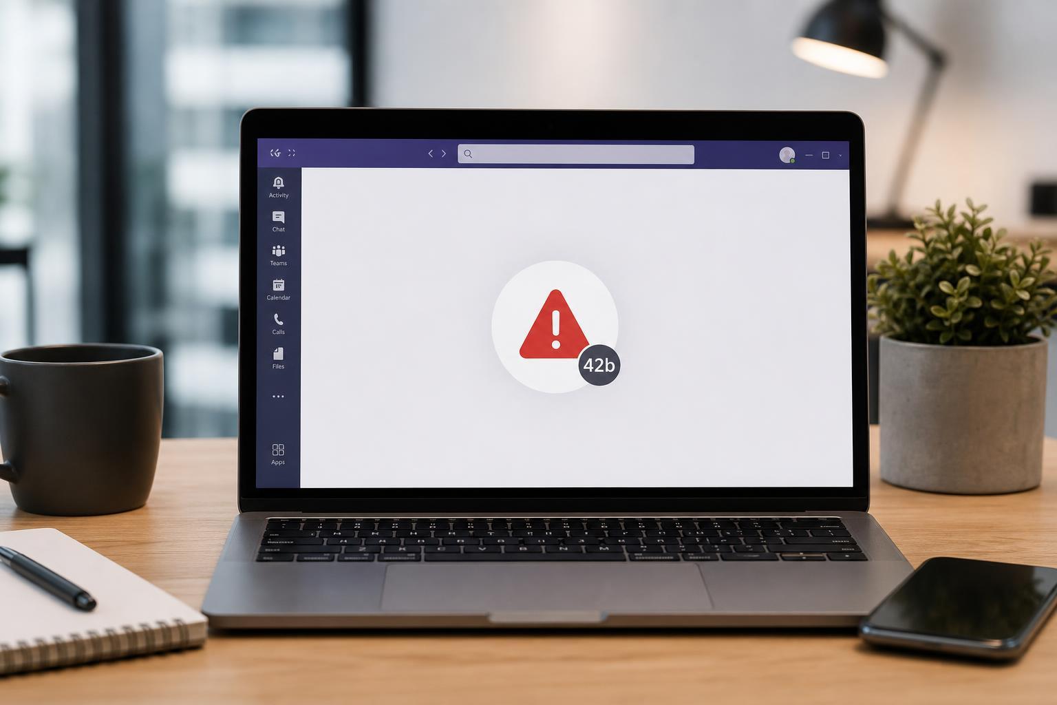
The Microsoft Teams banner became a talking point because it did more than announce a product update — it changed how users felt about the service. For many people, the reaction was not really about the banner itself, but about timing, trust, and the way Microsoft communicates changes to software they rely on every day.
If you’re wondering why something as simple as a banner created so much outrage, the answer is a mix of design choice, user expectations, and frustration built up around Teams over time.
What the Banner Actually Signaled
In most cases, a banner in Teams is just a notification area for announcements, feature changes, or service messages. But when Microsoft uses that space to promote a major change, users tend to read it as more than a routine update.
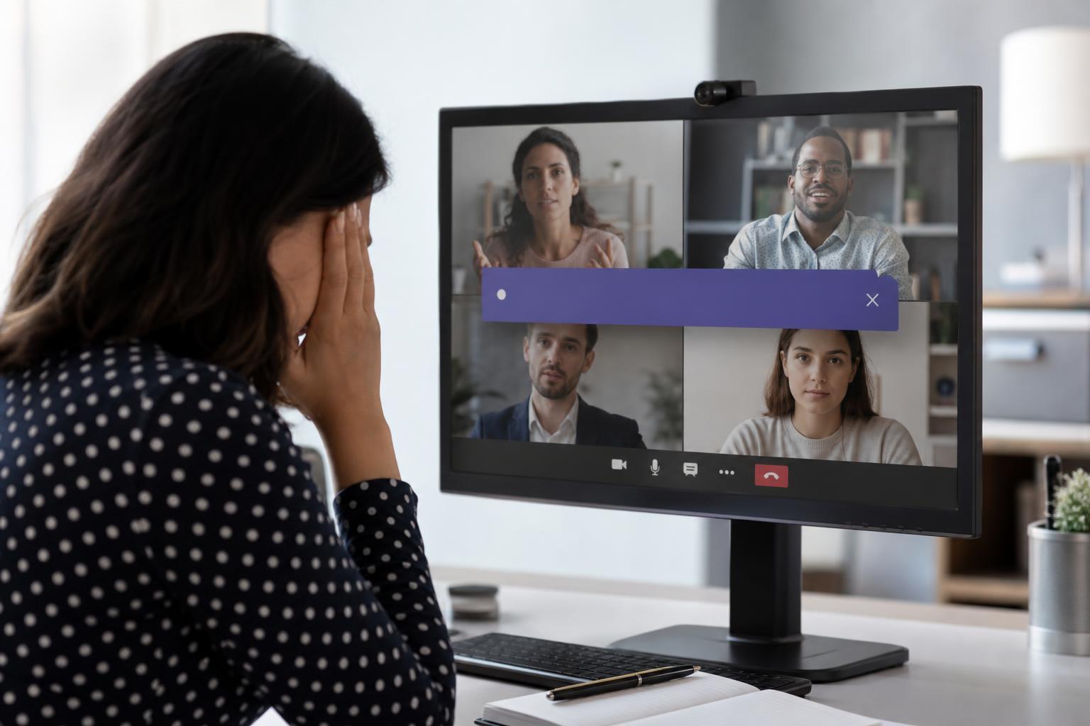
That is especially true when the message appears inside a business tool people depend on for meetings, chat, and work communication. A banner can feel intrusive when it appears in the middle of a workflow, even if the information it carries is technically important.
Why People Reacted So Strongly
- It interrupted a tool people use for work, so it felt unavoidable.
- The message likely reminded users of broader complaints about Teams, such as clutter, performance, or frequent changes.
- Some people interpreted the banner as Microsoft pushing a message rather than listening to user feedback.
- Visible in-app messaging can feel repetitive if users see similar announcements across Microsoft products.
- When a product already has a mixed reputation, even a small design choice can trigger a larger backlash.
The Role of Microsoft Teams’ Reputation
Teams has long been a product people either depend on heavily or tolerate because their organization requires it. That makes any branding or messaging decision more controversial than it would be in a casual consumer app.
If users already feel that Teams is too busy, too pushy, or too tied to Microsoft’s larger ecosystem, a banner can become a symbol of those bigger frustrations. In other words, the banner itself may not be the main problem — it simply gives people a visible target for complaints they already had.
Common Reasons Users Dislike In-App Banners
- They interrupt focus during meetings or messaging.
- They can make the interface feel more crowded.
- They may be mistaken for errors or alerts.
- They sometimes promote features users do not want or cannot control.
- They suggest that product priorities are being driven by marketing instead of usability.
Was the Banner the Real Problem?
Usually, no. The banner was more of a trigger than a root cause. The real issue was the relationship between Microsoft and its users: when people feel that software changes are imposed on them, they tend to respond negatively to anything that looks like promotion or overreach.
That is why the reaction spread quickly. The banner became shorthand for larger concerns about product direction, user control, and how much say people really have in the software they are expected to use.
What Microsoft Can Learn From the Reaction
- Keep in-app messages clearly tied to practical user value.
- Avoid placing promotional banners where they disrupt active work.
- Give organizations more control over which messages appear.
- Make announcements easy to dismiss without hiding important information.
- Be careful with tone, since users often react to how a message feels, not just what it says.
The main lesson is simple: in workplace software, presentation matters as much as content. A message that looks harmless in a design mockup can feel irritating or manipulative once it appears inside a live work session.
What This Means for Users
For users, the outrage is a reminder that interface changes are often about more than aesthetics. They can affect trust, attention, and how much control people feel they have over their tools.
If a banner seems unnecessary or disruptive, that reaction is not petty. In software used for work, small design choices can have an outsized effect on the overall experience.